Introduction
Blue and green - these two colors definitely remind us all of the sea! And of course, they are the perfect two when it comes to painting landscapes. However, not only do they look good together, but they also create a beautiful mix. Here is all you need to know about the new color!
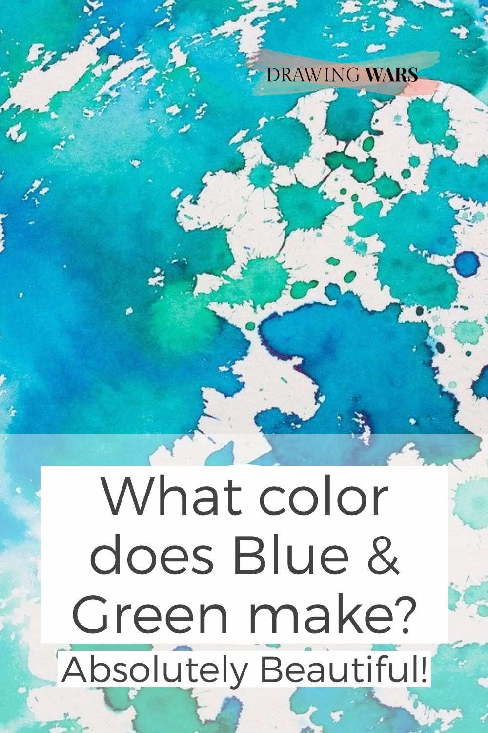
Green and blue are mixed together to create aqua, also known as cyan. Depending on the green you use, the cyan hue could either be slightly warmer or cooler. However, regardless of the hues of blue and green used, the result would be a hue of blue-green or aqua.
1. Understanding the color wheel and color theory
You will find blue and green among the cool colors on the color wheel!
Aqua is a cool shade created by blue and green. The blue-green color sits next to blue and cool green on the color wheel.

Where is aqua on the color wheel?
Although there is a warm green (yellow-green) as well, but to get the aqua shade, you would need the cool green. You can see a very awesome blue-green color right next to the cool green on the color wheel. On the outermost layer, you can see the actual blue-green color. So in order to create multiple tones of aqua, you can do the following:
- Tint: Add white to the original aqua color to create its ‘tint’. These tints could be used to create highlights and depict light in a painting that has aqua as its main color.
- Tone: Add grey to the original aqua color to create its ‘tone’. the grey color
- Shade: Add black to the original aqua color to create its ‘shade’.
2. Creating hues of aqua using Blue and Green
You can make aqua look more like the deep ocean!

The best part about aqua is how much you can play around with it. All the different tones and shades you can get by adding white or neutral colors will lead you to an ultimate blue-green palette that looks like an ocean.
For fun, you can also try using yellow-green with a cool blue. It will give you a warm blue-green tone which you can use for highlights!
What happens if you add more blue to the mix?
Since there are both cool and warm greens, it will depend on the green color you choose. Also if you keep adding more green, then the resulting color will be greenish-brown.
What happens if you add more green to the mix?
Since adding green will make the aqua look less blue, you could take advantage of such a hue in greenery in landscapes.
PRO-TIP
Use sky blue
Sky blue or cerulean blue is a great choice for aqua. Mix it with viridian green and you'll get a hue of aqua that portrays both the sky and the sea.
3. The Color Psychology and Effects of Aqua
Aqua, like its name, immediately reminds us of the sea and the ocean.

Although aqua isn’t a neutral color, it provides the stability often associated with cool colors. Whether you add more blue or green to the mix, it doesn’t matter. So whether you’re using aqua in a drawing, painting, or a design element in any room, it would reflect the purity of water. It represents freshness, creativity, and emotional maturity.
On the other hand, aqua could also reflect narcissism, secrecy , arrogance and stress.
point to remember
tints and shades of aqua
Tints of aqua would be its lighter hues, whereas the shades of aqua would be the darker hues.
4. How is Aqua Used in Painting?
Aqua is a must-have color for any fresh seascape painting.

Aqua can be used to add cool temperature in paintings and to depict the natural texture of water.
When referring to the cool colors, aqua is mostly used for portraying the ocean or the sea. It can easily add depth to the texture of the water. If you add a bit of dark blue, black, brown, or any dark neutral color, you could easily create stunning shadows using aqua.
Using aqua in various painting media
Acrylic paints: To make sure the texture is smooth for acrylics, you can use a gloss or matt gel to make the aqua shade look thicker. We wouldn’t advise mixing green and blue directly on the canvas unless you’re fast at handling acrylics because they dry up very easily!
Oil paints: Blue and green (if on the same tonal value) can get overwhelming. For the sake of contrast, use mix white and black into the blues and greens alla prima (wet-on-wet) while you’re working on the canvas.
Watercolors: This is the medium where you get to play with blue and green as much as you want. To make the artwork fun, take multiple blues and greens and allow them to play out on wet paper. You will get various tones and shades of aqua this way!
Gouache: For gouache, use only one green and one blue. And don’t add too much water or else the mixing could appear grainy.
Creating an underpainting with aqua
Do you want to create a painting with a cool and relaxing atmosphere? If yes, you can use aqua shades and tones for producing a monochromatic painting or even an underpainting. Doing an underpainting before the actual artwork can assure you smoother results and make the light shadow clearer. It is a monochromatic painting that clearly indicates the darkest and the lightest spots in a painting.
Aqua in Portrait Paintings
How can you use aqua in portrait paintings? While using aqua or blue tones as is in a portrait painting may sound strange, but you can use it for highlights. Or if you like making the abstract sort of portraits, you can even give shadows using aqua.
Aqua in Landscape Paintings
Using tones, tints and shades of aqua can add brilliant light and shadow to the texture of the sea and the ocean.
PRO-TIP
create cool shadows with aqua
It's a rule of thumb that warm light creates cool shadows. And you couldn't get a shade that's as cool as aqua! So instead of going for pitch black for shadows (which could look unnatural), you should just use aqua instead.
5. How is Aqua Used in Drawing?
Aqua can look great in monochromatic or analogous drawings.

Use aqua shades to create gentle strokes and textures for the sky and the sea. Analogous color scheme includes similar colors that are adjacent to each other on the color wheel.
In a drawing, tones and shades of aqua can be created by controlling the pressure. But this is just for normal pencils and colored pencils. You could have a wide range of blue-green hues.
Using aqua in various drawing media
Pastels and Chalk: With pastels, it’s best to have just one shade of blue and one green. Mixing too many different colors can end up in the resulting color looking dull and grey.
Ink: Creating blue-green or aqua in inks is the easiest! However, you can also use the inks spontaneously and directly on the surface. This technique would be similar to the wet-in-wet technique using watercolor paints.
Colored pencils: You could have a wide range of blue-green hues. If you have polychromos pencils, you could easily blend blues and greens together. This is great if you don’t want to invest in a bigger colored pencil set.
Drawing pens: With drawing pens, blending isn’t possible to achieve the flowy effect of water. However, you can use tiny scribbles and place blues and greens together to create the illusion of aqua and other blue-green hues.
Markers: With translucent markers, you can overlap multiple layers of the same brown hue. To add more variety, you can add various layers in different hues of brown too. If you don’t have brown, try overlapping a shade of orange and blue instead and you’ll get your desired result! In the case of permanent or opaque markers it’s best to find an aqua shade as is, since layering is difficult.
Brush pens: This versatile drawing medium usually comes in packs having colors that go well with each other. If you’re truly looking for a blue-green pack that reminds you of the ocean, definitely go for
Tombow Dual Brush Pens (Ocean Pack)
This pack contains hues of blues and greens essential for any seascape. There is a blender that can help smoothen the artwork.
6. How is Aqua Used in Design?
The color of the sky and the sea can breathe life and openness into any space.

Aqua is a cool color, which can make any space open but at the same, it could appear flat too. Follow these tips to make the most out of using aqua in interior design:
- So in order to lighten things up and make a space pop, you should add a saturated warm tone.
- If you want to create a monochromatic look, try indigo as it is naturally darker than aqua.
- Add a few neutral colors like grey, white, and black for high tonal contrast.
PRO-TIP
use aqua as a decor element
Instead of using aqua as a core element such as wall paint or wallpaper, get decor items instead. For instance, a painting containing shades of aqua, some tiny aqua glasses or vases, etc.
Conclusion
So mixing blue and green will give you aqua, which is also known as cyan. It is a cool color that reflects emotional maturity, freshness, and calmness. If it’s not balanced properly it could even represent arrogance If you want the brown to be cooler, you will need to add a cool blue to the mix. The color is very popular for seascapes and giving subtle tints in portraits. In design too, it can make any space look more lively and open.
If you want to learn more about color mixing using green, read this post on the color created by mixing green and red !
What color does Green & Red make? Absolutely Beautiful!
Green and red are opposite to each other on the color wheel. This makes them complementary colors, but what do they create when mixed? Here's the answer!

By Jimena & Iñigo
The Navarro-Rubios
My husband and I are learning how to draw and paint. We wanted to share this learning process with the world and have fun! That's why we created this blog. We'll have drawing contests every week and you'll decide who won that week! Follow along and learn with us!

Jimena & Iñigo
The Navarro-Rubios
My husband and I are learning how to draw and paint. We wanted to share this learning process with the world and have fun! That's why we created this blog. We'll have drawing contests every week and you'll decide who won that week! Follow along and learn with us!


